Energy sharing rests on a promise: the electricity you consume (or produce) is genuinely exchanged with your community neighbours. But you need to be able to verify it. That is the role of My Community, the monitoring platform available to every member of RaYSun-managed communities: your real flows, meter by meter, from month to quarter-hour. Here is a guided tour.
How do you access it?
The My Communitybutton at the top of this website leads to the platform's login page. Access opens automatically for every member: as soon as your first month of data exchanges is available, you receive an invitation e-mail guiding you to create your password. Two minutes later, you are in your portal.
Three areas in your member portal
- Exchange tracking — your real energy flows, measured on your meters. That is what this article is about.
- Your invoices — find the invoices linked to the operation and, if you are a producer, the documents that let you invoice the community.
- The ambassador programme — offered to every member to grow their community: the more varied its profiles, the better sharing works for everyone.
1. Your energy summary, at a glance
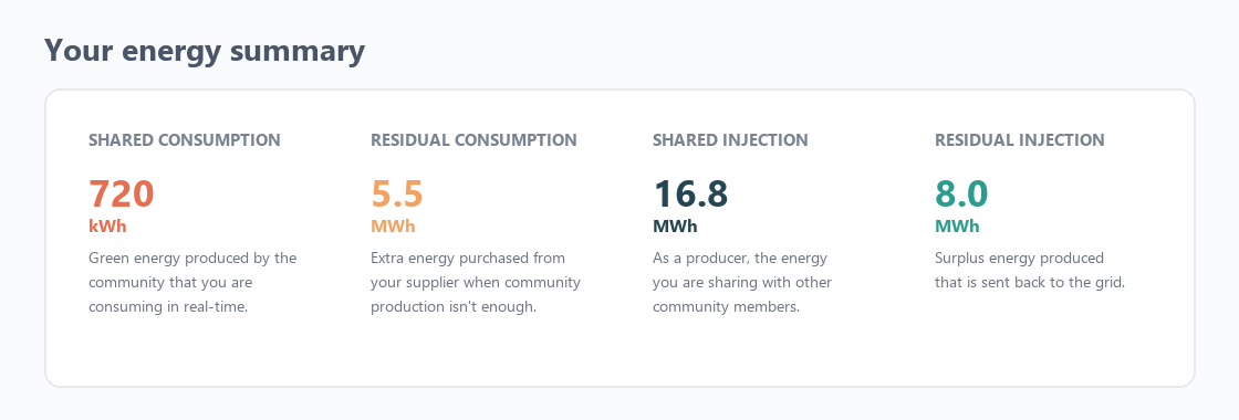
As soon as you enter the tracking view, four indicators sum up your situation for the chosen period:
- Shared consumption — the green energy produced by the community that you consumed directly;
- Residual consumption — the top-up bought from your supplier when the community's production is not enough;
- Shared injection — as a producer, the energy you shared with the other members;
- Residual injection — the surplus that went back to the grid.
At a glance, you know what share of your needs the community covered — and what share of your production found a local taker.
2. Your flows, month by month
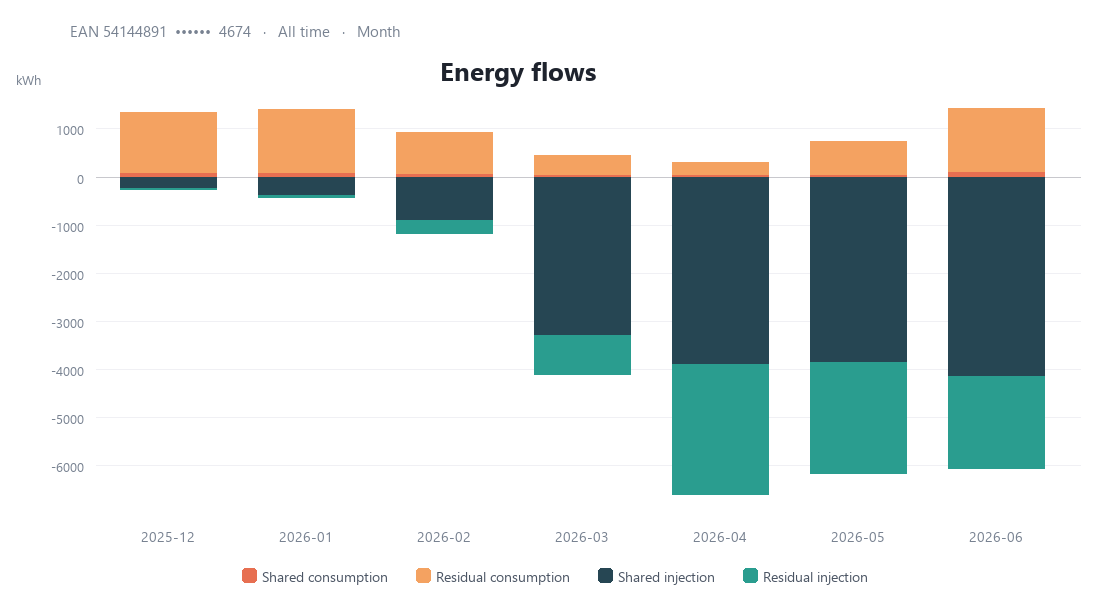
The energy flows chart displays your exchanges over time. Three filters are all you need: your delivery point (EAN code) — or all your points at once if you have several —, the period, and the granularity. In monthly view, seasonality jumps out: sharing follows the sun, and you see month by month what the community brought you.
3. Zoom in to the quarter-hour
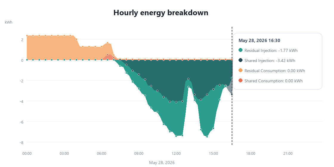
Switch the granularity to day and each bar becomes a day. Click on one of them: the platform opens the hour-by-hour detail, in 15-minute steps — the same resolution as your smart meter. You see precisely when your production goes to the community, when you consume locally, and when the grid takes over. Enough to spot, for instance, that shifting certain uses to sunny hours would further increase your share of shared energy.
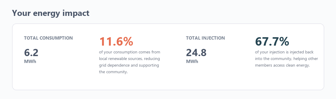
4. Your impact, in two percentages
The "impact" section turns your flows into two telling figures: the share of your consumption coming from local renewable sources, and the share of your injection valued within the community rather than lost to the grid. They are the same indicators we publish in our case studies — transparency applies to everyone.
Consumer, producer… or both
The platform adapts to your profile. Consumer? You track what the community brings you. Producer? You track how your surplus is valued. Prosumer — both at once? You see all your flows, incoming and outgoing, on a single screen.
This visibility is not an option at RaYSun: it is the standard offered to every member, because energy sharing that works is energy sharing that gets measured. Curious what it would look like for your organisation? Request your free assessment or discover the Energilia operations.